Thank you for showing interest in this theme. Please go through all the documentation before you start using the theme. This will help you to use the theme for your Ghost publication in the best possible way.
Why we developed Orchid?
Orchid is an elegant and fast Ghost theme. We have maintained a clean and elegant design to keep it performant. You can check the Google PageSpeed score of this theme and analyze the scores yourself. It is one of the best-performing Ghost themes available.
This theme is best suitable for fashion blogs with an elegant look.
Performance
GTMetrix Score
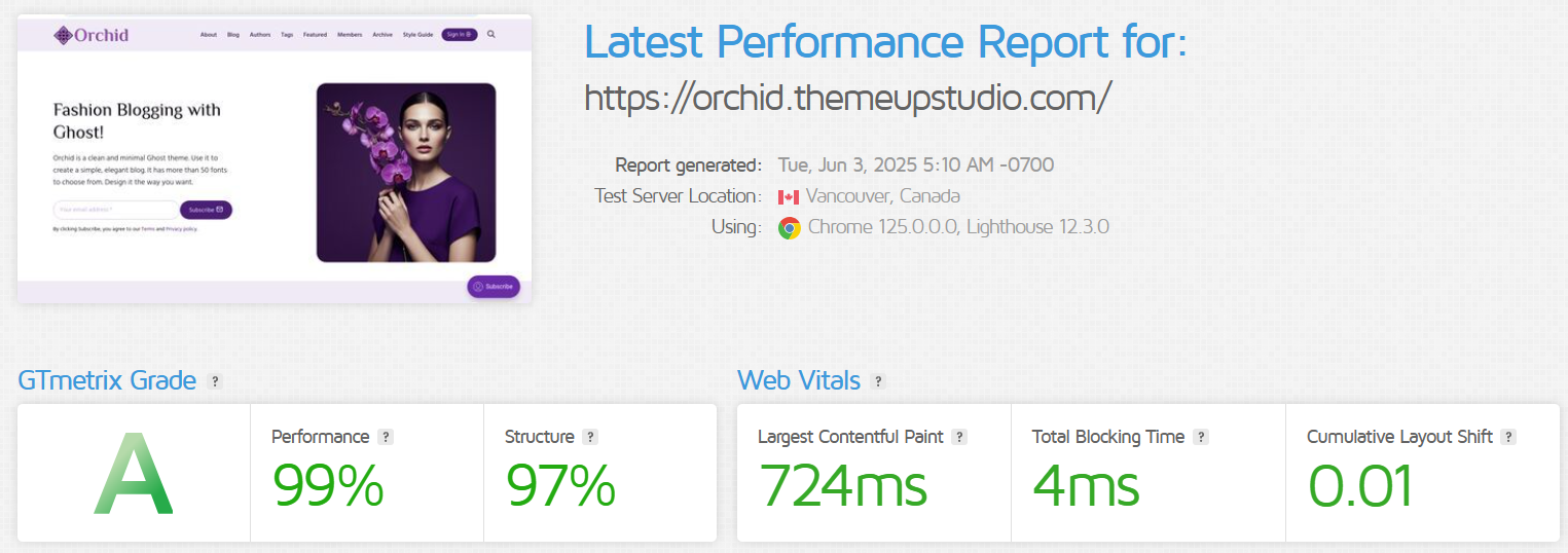
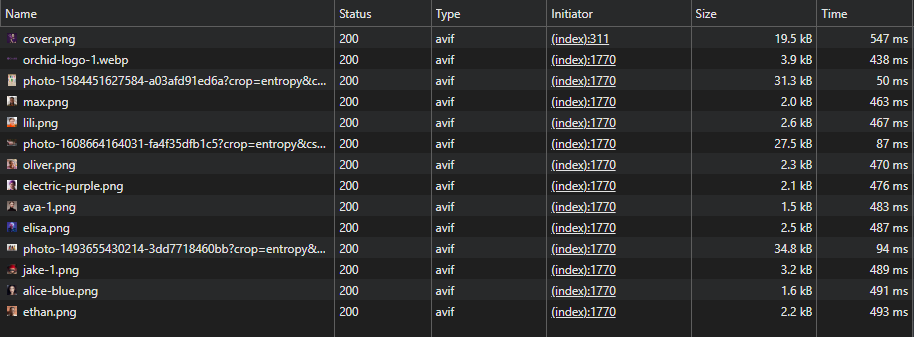
We were able to get some pretty great scores. This theme also supports next-gen image formats (avif and webp). The image conversion will happen automatically. You can upload JPEG or PNG images, and Ghost will automatically convert multiple image sizes in avif and webp format. The theme will then load these images depending on the browser. If a browser does not support avif format, the theme will use webp image as a fallback.
Using avif or webp images considerably reduces the image size. Please see the below snapshot about the considerable improvement in image size.
Please note that the performance of the website also depends on the server you choose for hosting.
The performance also depends on the 3rd party scripts you include for analytics, payment gateway and more.
Theme Installation
You will get a zip file as a download after you purchase the theme. You need to upload that zip archive to your Ghost publication directly.
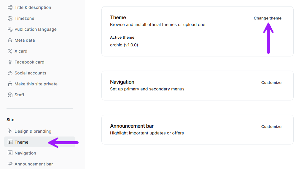
- Login to your Ghost website at 'https://www.example.com/ghost'
- Go to Settings > Theme > Change theme > Upload theme
- Upload the zip file you downloaded after your purchase
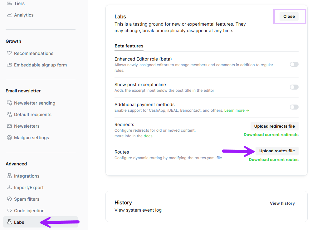
Upload routes.yaml
To use the custom pages like Archive, Tags, and Authors, you need to upload the routes.yaml file.
- Download the purchased theme file in zip format
- Extract the routes.yaml file to your machine
- Open your Ghost publication and go to Settings > Labs > (Open) > Upload routes file
- You can download the existing routes.yaml file for backup
Configuration & Settings
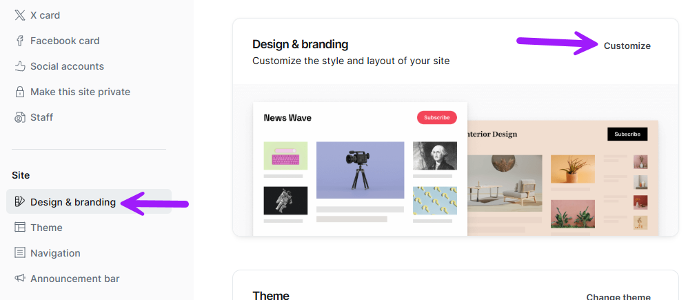
The theme comes with some configurable settings from the Ghost admin menu. To access these settings:
- Open Settings > Design & Branding > Customize
- The customizable settings from the theme will open in a pop-up
Brand Settings
These are the default settings that Ghost provides. These are not dependent on the theme. We will go through each setting one by one.
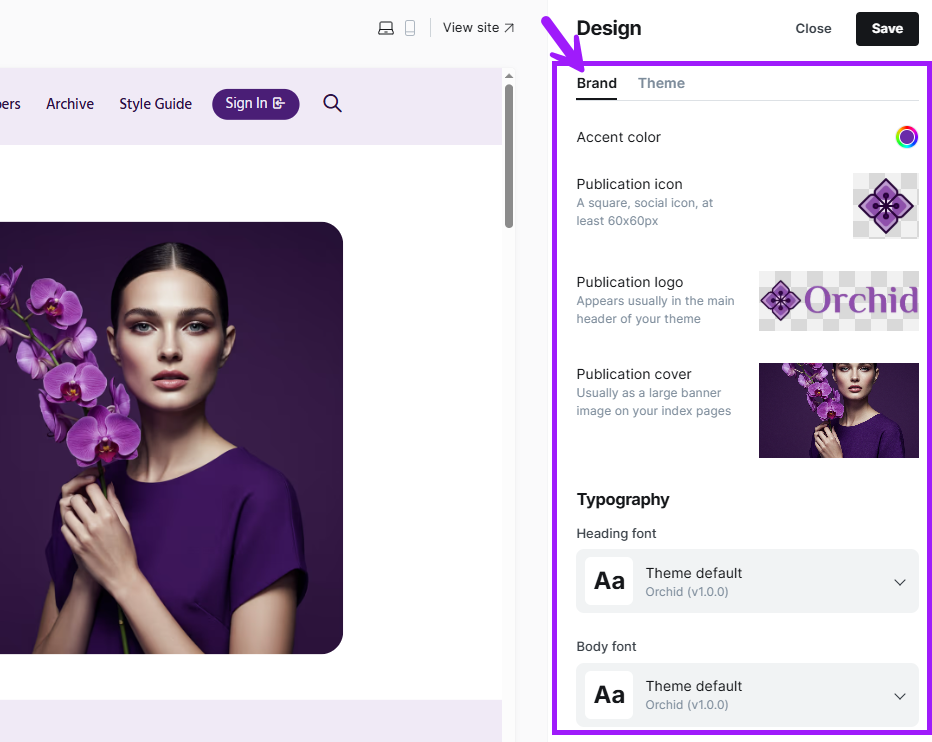
Accent color: This is the main color of the website. This color is also used in various places like buttons, editor cards, and page headers. The theme automatically generates different colors based on the accent color. Below is a snapshot of how the website will look if we set it to green.
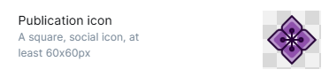
Publication Icon: This is the favicon of your brand. Upload a square image.
Publication logo: Your brand logo will appear in the website's top left corner. Do not use an oversized image here. This image will load on every page, and if you use an oversized image, it will greatly hamper your load times. Although, the theme will automatically use a reduced size image in webp/avif format.
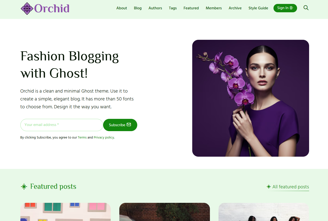
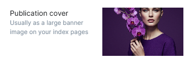
Publication Cover: This image will appear on the hero section of the website. Based on the website hero layout, it will appear on the right hand side or on the center.
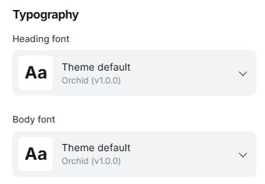
Typography: Orchid supports the typography settings privided by Ghost. You can use the fonts under this or use more than 50 fonts provided by Orchid under Theme Settings.
Theme Settings
These settings are configurable and are provided by the theme. Any change in these settings will affect the look of the website.
Homepage
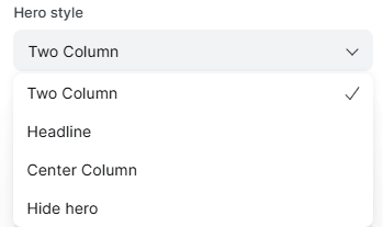
Hero style: Orchid provides three different hero styles for your homepage.
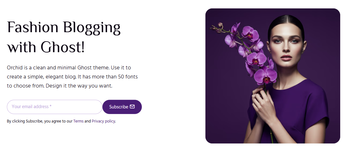
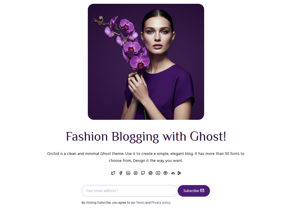
Title/Subtitle: Add the title and subtitle for hero section in homepage
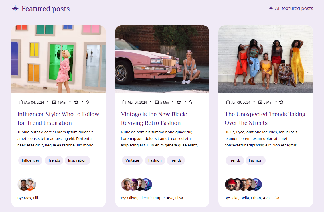
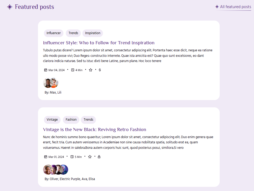
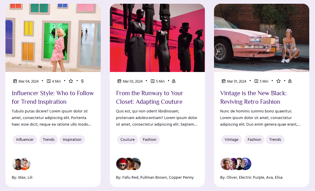
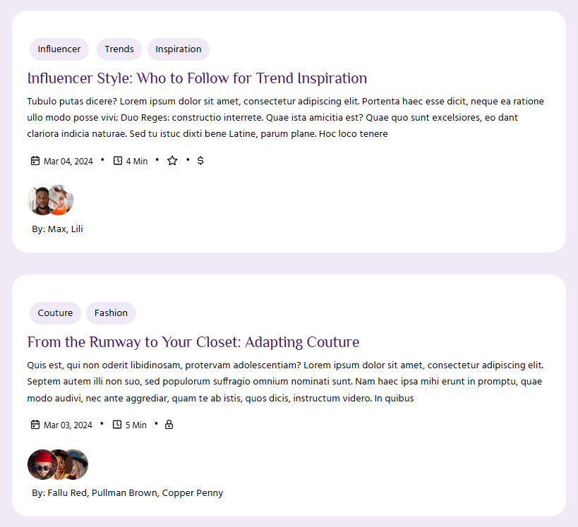
Featured post card style: This will only affect the card style of featured post cards under Featured posts section on homepage. You can select from either grid/list.
Site-wide
Post card style: Select the layout of post card displayed site wide. This layout will be used in Archive, Tags, Authors, Blog and all other pages where articles are loaded.
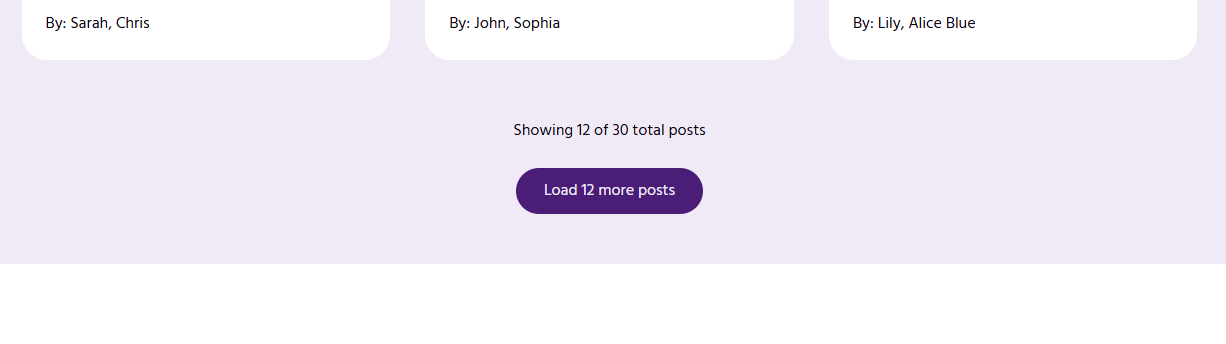
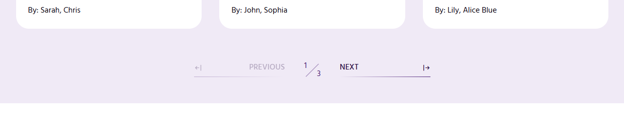
Pagination Style: Theme has two available pagination styles -
Infinite load: This will add a load more button at the bottom of post cards.
Paginated Pages: This will add Next and Previous button links.
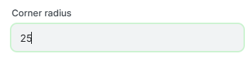
Corner radius: This will change the corner radius of all elements across the website. You can change it to any radius. Default radius set is 25px. If you make it 0px, then all elements will have sharp corners, as shown below.
Primary font (and Secondary font): The Google Font to use across the website's heading elements.
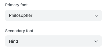
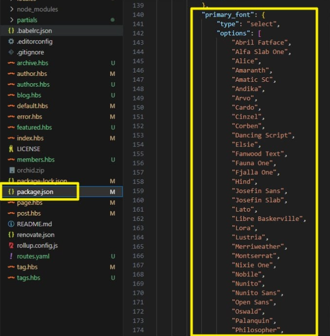
This theme comes with a default selection of 50 Google fonts:
You need to edit the theme code if you want to use a different Google font. Open theme code in your favourite editor and look for 'package.json' in the root folder. Add the additional font options you would like to add in the 'Primary font' dropdown.
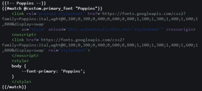
For example, if you would like to add the 'Poppins' font, your edited code would look like this.
Please note that we added an additional option for the Poppins font on line number 9 in the below code snippet.
"typography": {
  "type": "select",
  "options": [
    "Inter",
    "Cabin",
    "Lora",
    "Manrope",
    "Inconsolata",
    "Poppins"
  ],
  "default": "Inter"
}
The above change will add the option for 'Poppins' font in the Admin settings, but it will not work yet.
We need to include the font-specific files from Google fonts in 'fonts.hbs'
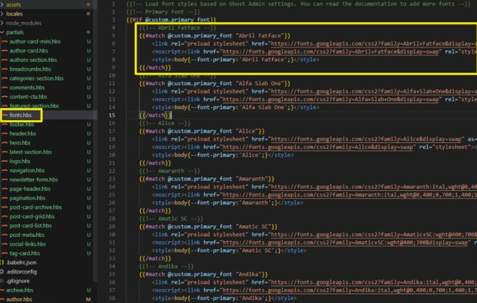
Open default.hbs file and duplicate the highlighted code in the above image. Get the font details like URL and font-family for 'Poppins' font from Google Fonts website and replace them in the duplicated code. Please see the code below for 'Poppins' font.
Post Settings
This group of settings controls the look and layout of your posts.
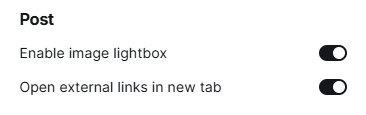
Enable image lightbox: This will control the opening of images and gallery images in a lightbox popup. Lightbox is a javascript library that will open the image in a popup, as shown below. You can navigate through the images using lightbox.
If you disable the lightbox, then the images will appear as it is without the ability to click on them and see the larger version. As you can see in the below image, all images appear smaller in size and it becomes difficult to see them when used in a gallery card.
Open external links in new tab: If enabled, then all external links will open in a new tab.
Language Support
This theme is fully translatable to any language. The theme utilizes the {{t}} translate helper for all labels and messages.
Out of the box, it supports 15 languages, which are:
- Czech (cs)
- German (de)
- English (en)
- Spanish (es)
- French (fr)
- Hindi (hi)
- Hungarian (hu)
- Italian (it)
- Japanese (ja)
- Dutch (nl)
- Polish (pl)
- Portuguese (pt)
- Russian (ru)
- Turkish (tr)
- Chinese (zh)
You can add your language (if not already supported) by creating a locales file under the 'locales' folder in the theme.
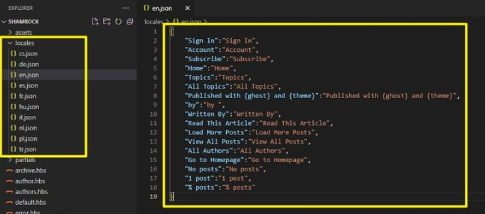
To create the locales json file, use the ISO Language code of the new language you want to add. For e.g. for Portuguese, it will be 'pt.json'.
In 'pt.json' add the translations in key:value pair. For e.g. if we want to translate 'Sign In' to Portuguese, then the content in 'pt.json' locales file would be:
<pre>
<code class="lang-json">{
    "Sign In":"Entrar"
}
</code>
</pre>
Similarly, you can add all the translations for multiple labels.
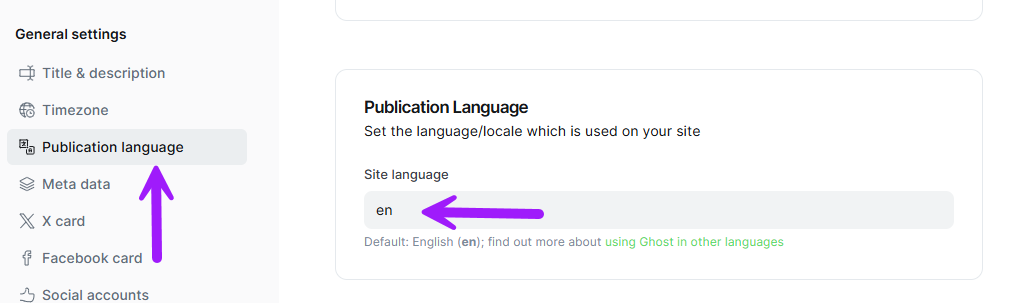
Once you create the complete locales JSON file, change your publication language in Settings > Publication Language and enter the ISO language code (e.g. 'pt') instead of the default 'en' for English language.
Stand Out Features
Orchid is a unique themes which a few features that other themes on the market do not have.
Auto Color: Once you change the main accent color, it automatically generates different shades of the accent color to use for different elements. This gives a cohesive look.
Auto Author's Tagline: Orchid also generates tagline for authors from a list of pre-defined set. Once a tagline is generated, it is stored in the local storage, so that a repeat entry to that author does not modifies it.
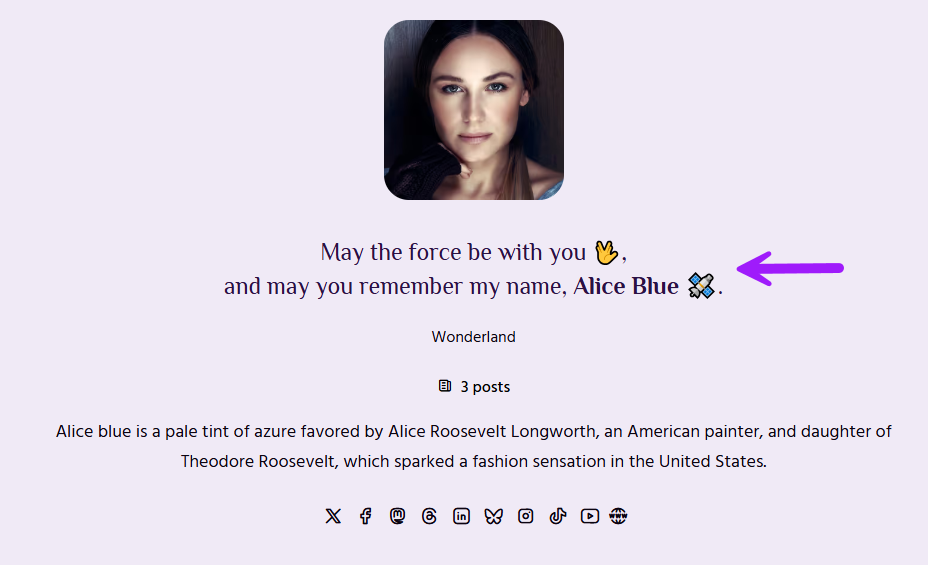
To update Author's tagline, edit the theme code on line# 105 in helpers.js file.
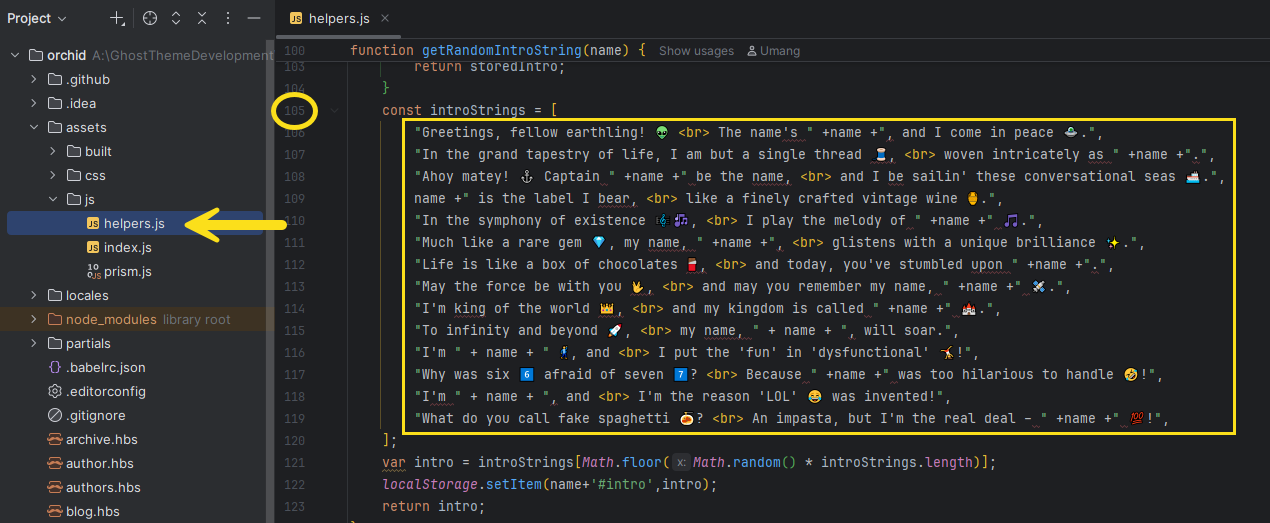
Add new taglines in double quotes "your tagline goes here" and append a comma , at the end.
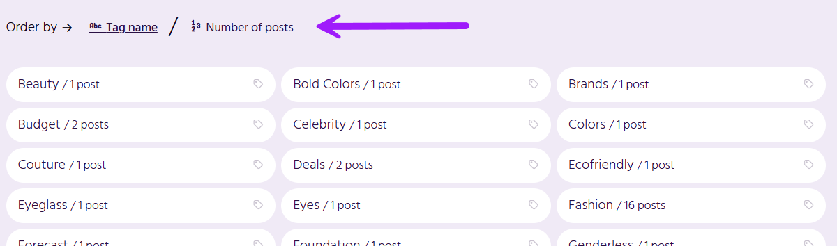
Order Tags by name or number of posts: The 'Tags' page allows you to sort the tags by name A > Z of number of posts in descending order.
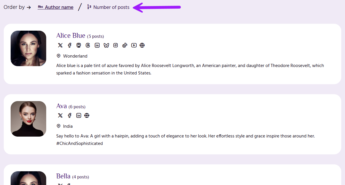
Order Authors by name or number of posts: Similar to the tags page, you can sort authors by their name or number of posts in descending order.
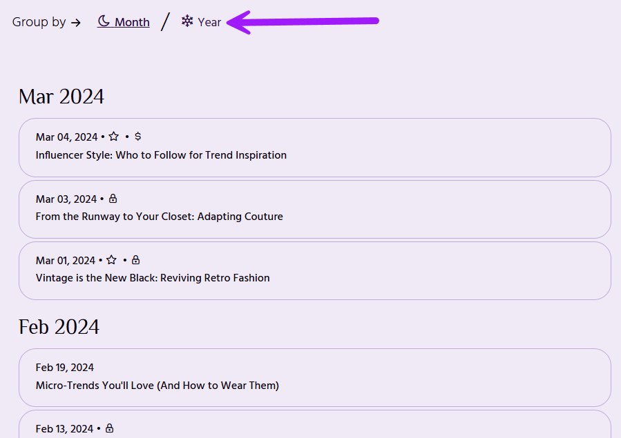
Archive page group by Month/Year: You can group the posts on Archive page by either month or year.
Contact Us
If you are stuck with any query or have any pre-sale question, please feel free to contact us.